3ME Arquitectura
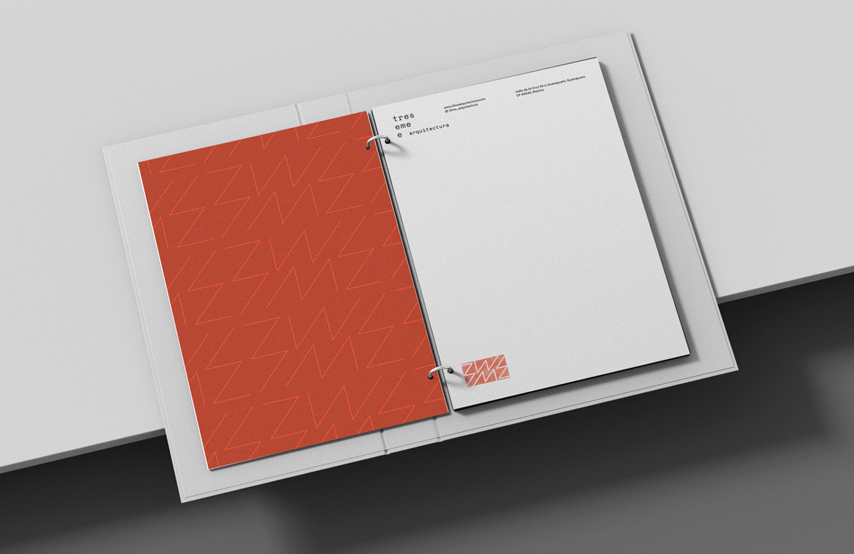
Brand identity. Digital and printed material.
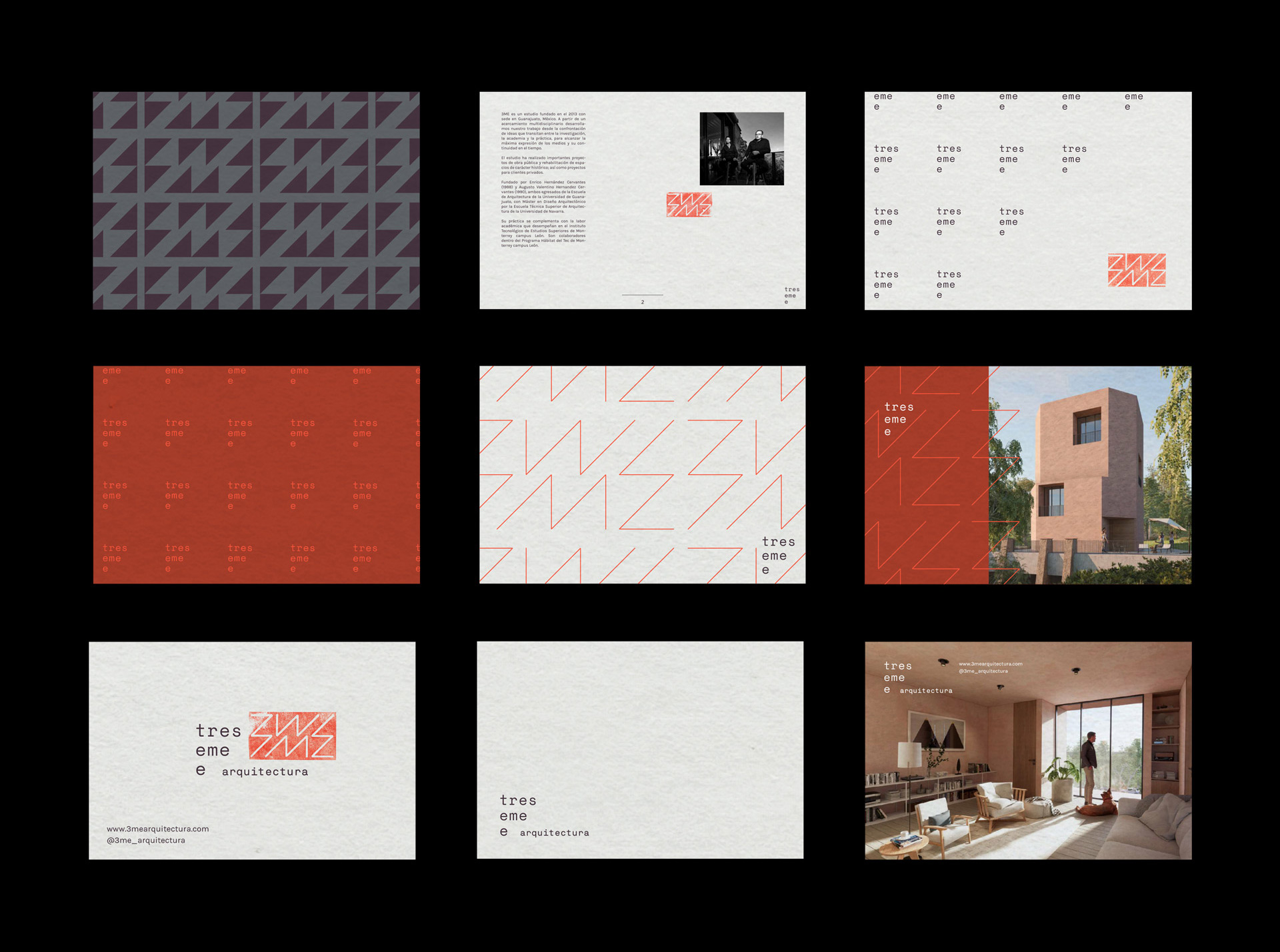
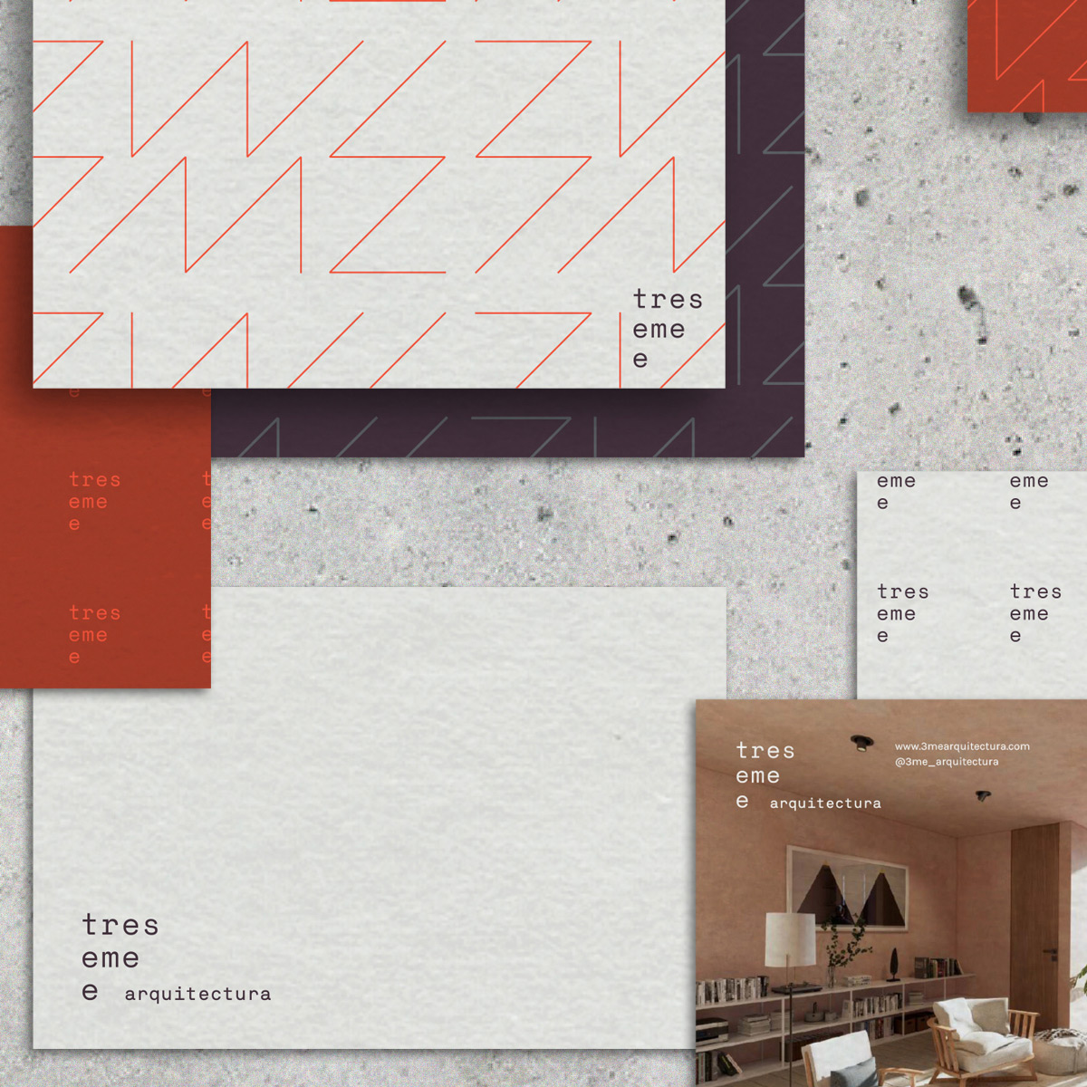
The main challenge was to capture the qualities in the studio’s practices and processes during the conceptualization and development of their projects. For the visual identity creation, we chose to highlight the manual and industrial work present in its architectural processes.
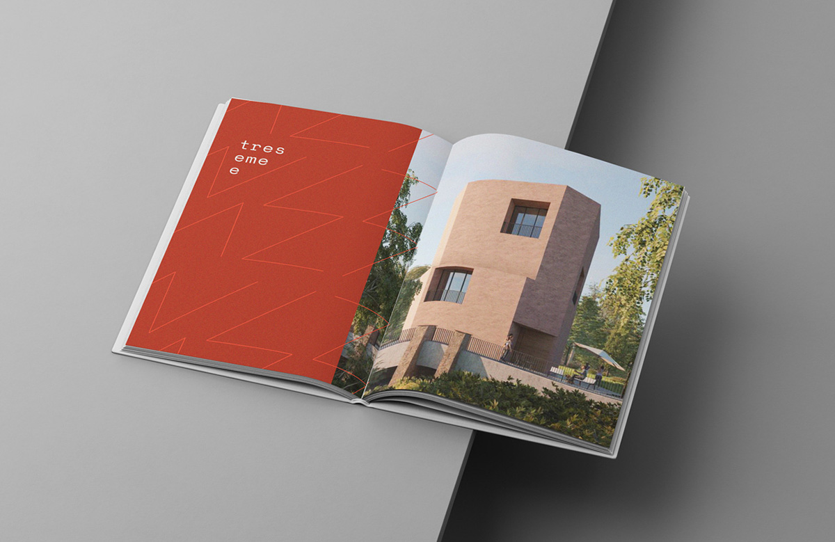
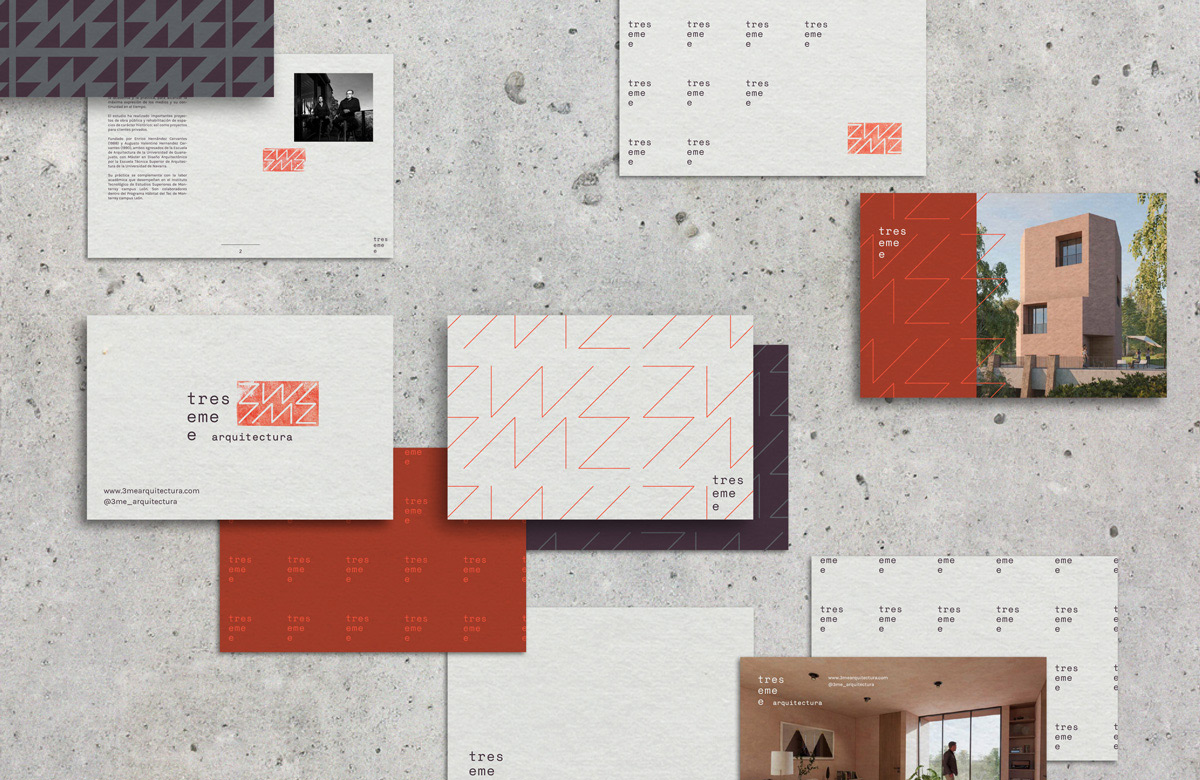
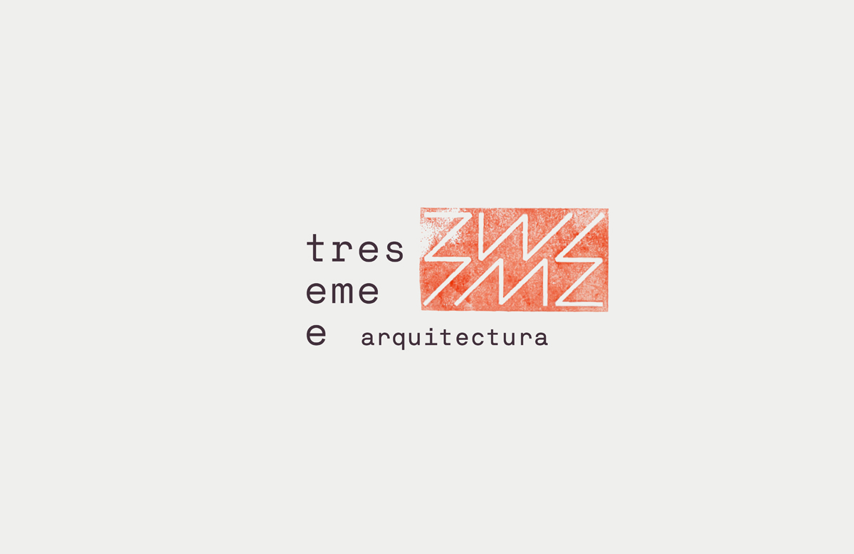
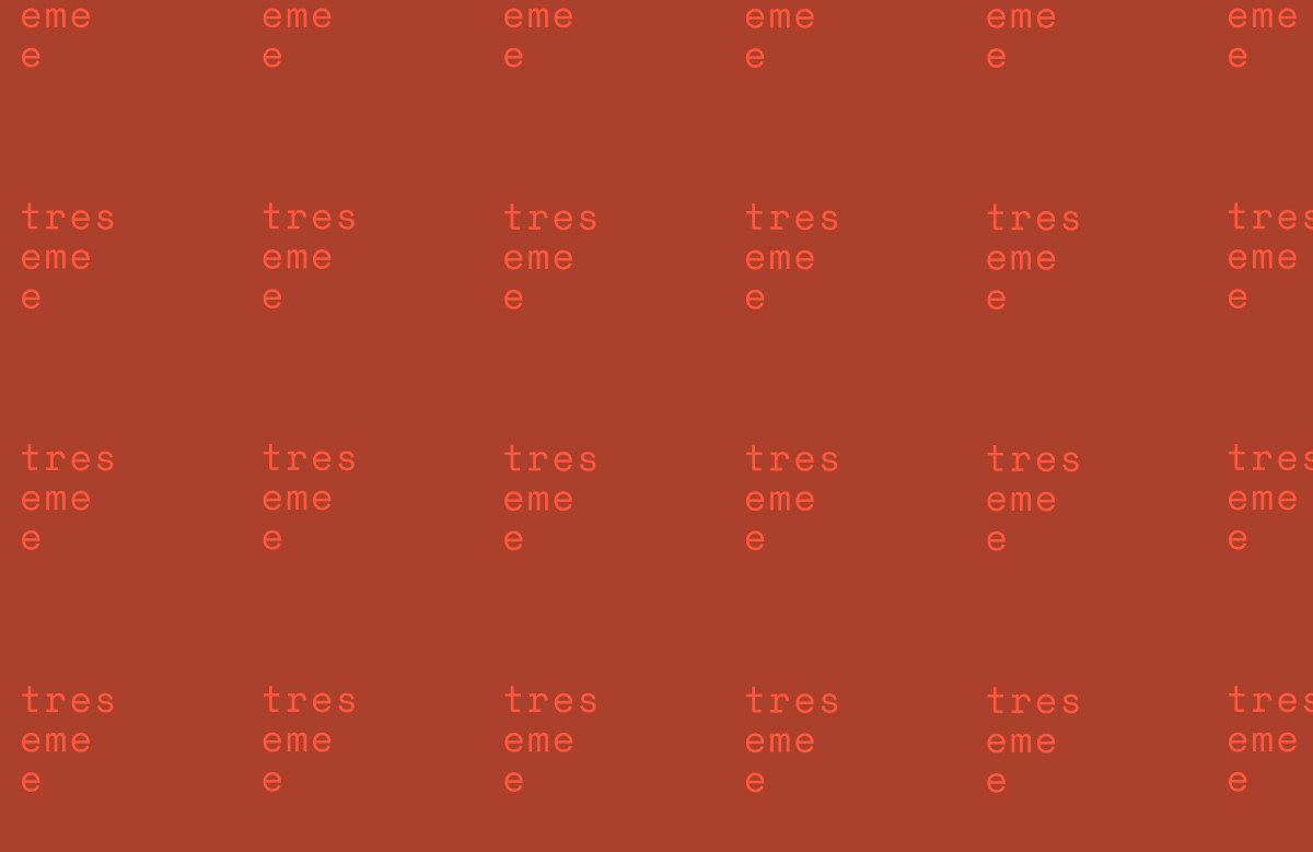
The logo consists of a typography chosen for its aesthetic qualities (monospaced and with a geometric base) and functional qualities (high legibility and uniformity).
The symbol is a reinterpretation of the name (3ME arquitectura) in which the type characters are represented with 4 identical glyphs. We digitized a series of textures to give the symbol a stamp effect that conveyed that “raw” look.
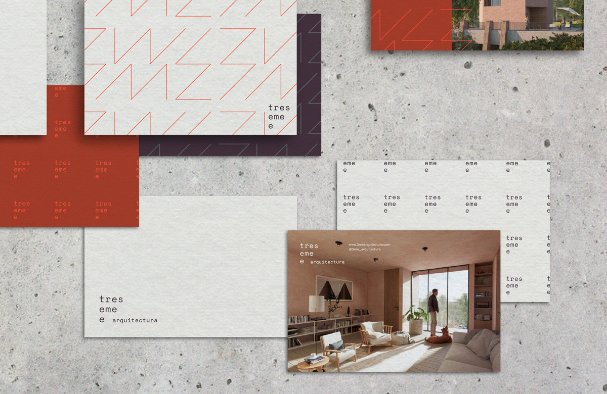
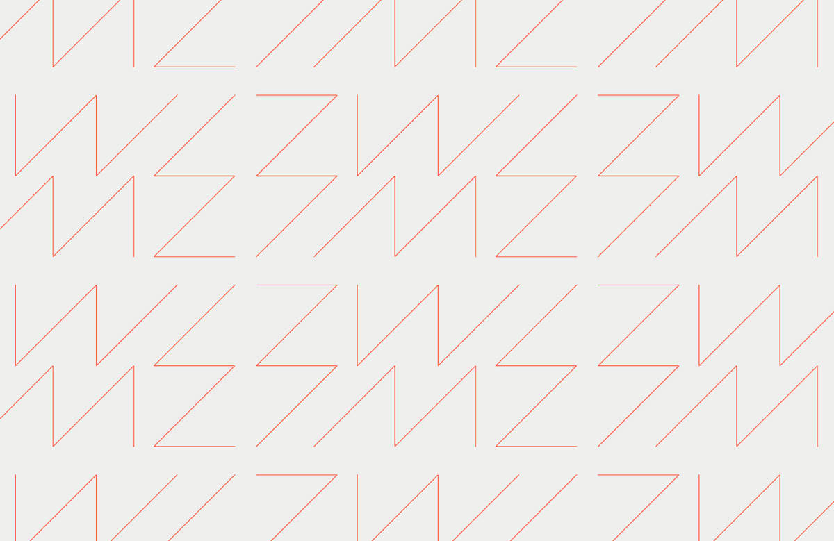
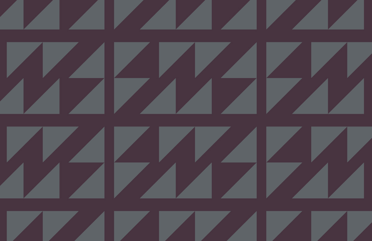
The graphics emerge from geometric strokes based on the symbol itself. When multiplied, these strokes form a pattern that adapts to the format of each application, allowing greater flexibility of use.
Together, these elements refer to the idea of a “territory” where they interact with each other to function as a dynamic system.
+ Work
Orbi
Logos & Marks
3ME Arquitectura
Refugio
Ula
Pixeron
Terrarium Prints
Marvilla


